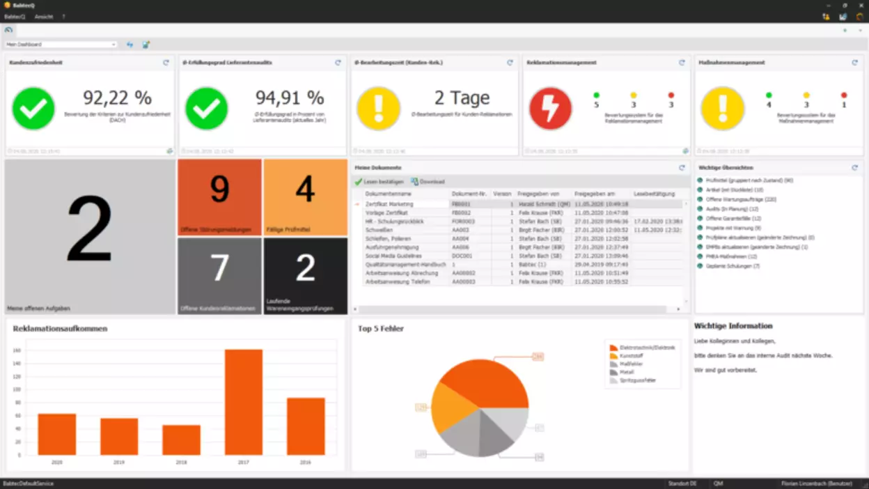
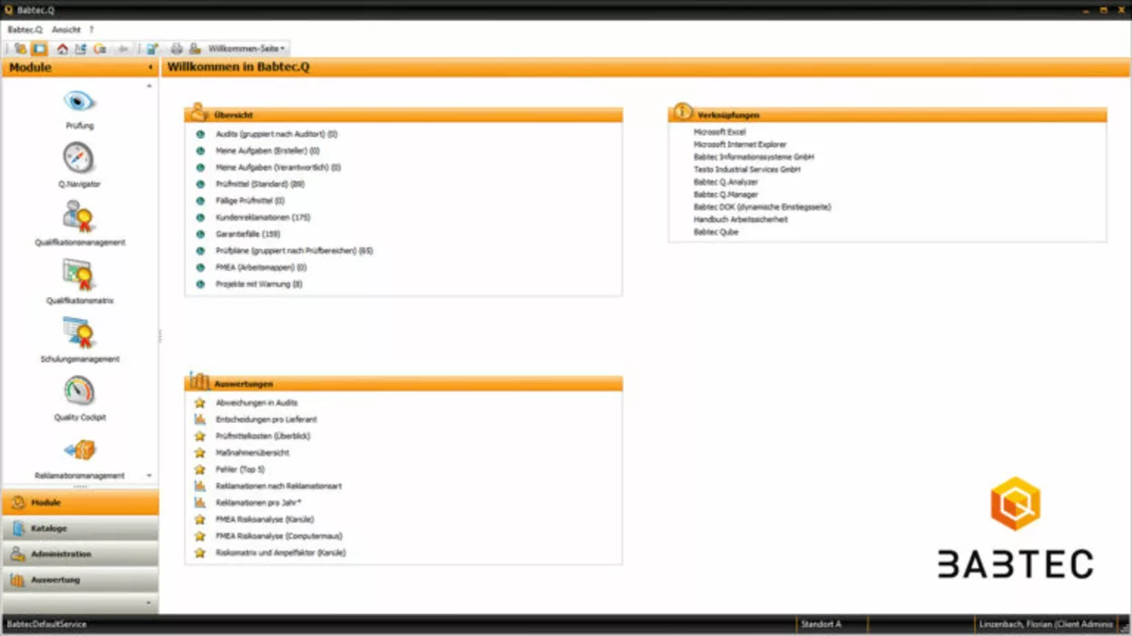
For me personally, the dashboard is special because it was one of my first major projects at Babtec. I’ve been part of the team since 2018 and was involved in the project quite early on. As part of it, I helped program the transfer of the old welcome page as well as all the new tiles of the dashboard. I had a lot of fun working on this project, so that just remains something special.
But even independent of my personal experience, there are simply some highlights on the new dashboard. Particularly noticeable, of course, is the image tile, where you can store images and – as luck would have it – even GIF files. This tile has already been very well received in our internal product training sessions and customers like it a lot, too.
Another visual, but also practical highlight are the view tiles with large numbers, which show, for example, open tasks or other important key figures at a glance. Here you can individually configure for which number the color changes. For example, I could say: up to the number of five open tasks, the view tile is colored green, up to ten open tasks yellow and from then on red.
Furthermore, very noticeable and at the same time very useful is the implementation of the Quality Cockpit tiles into the dashboard. This also allows me to see the important quality indicators and evaluations directly when I start using the BabtecQ software. And speaking of evaluations: pivot evaluation charts can also be mapped to the dashboard via tiles.
There are many more options, such as the notes tile, tiles for individual data sets of particularly frequently used modules, or the document tile with the interface to BabtecQ Go. What’s really special about our dashboard is how individually and effectively it can be designed with all these tiles via the dashboard designer.


Comments
No comments